7 Common Mistakes in Data Visualization
Posted on July 14, 2026 • 4 min read • 742 wordsTruncated axes, overloaded pie charts, too many colors… The 7 mistakes that make a chart unreadable or misleading, and how to fix them.

A chart is meant to clarify an idea. Poorly designed, it does the opposite: it confuses, or worse, it misleads — sometimes with no bad intent at all. The good news is that most failures come from the same handful of mistakes, easy to spot and fix. Here are seven, from the most misleading to the most subtle, with the remedy for each.
I. The truncated axis that exaggerates everything
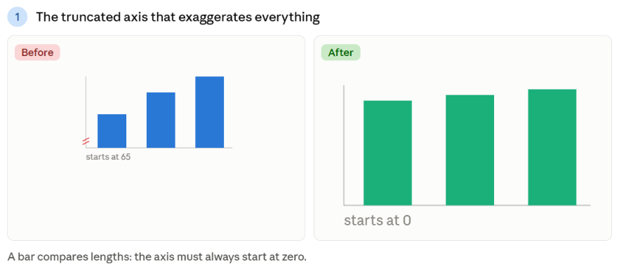
The problem: starting the vertical axis somewhere other than zero. A 2% difference can then look like a dramatic gap. It’s the most misleading mistake — and the most common in “loaded” charts.
How to fix it: for a bar chart, the axis must always start at zero, because you’re comparing lengths. A bar twice as long must mean twice as much. For a line chart, a non-zero axis is sometimes acceptable (you read a trend, not a length), but flag it clearly.
II. The overloaded pie chart
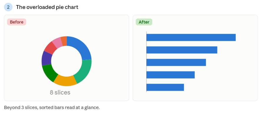
The problem: cramming 8, 10, or 12 slices into a pie chart. The eye can’t compare close angles, and the legend turns into a scavenger hunt between near-identical colors.
How to fix it: reserve the pie chart for 2 or 3 clearly distinct slices. Beyond that, switch to a bar chart sorted by value: the ranking reads instantly. For many hierarchical parts, a treemap does the job better.
III. Too many colors
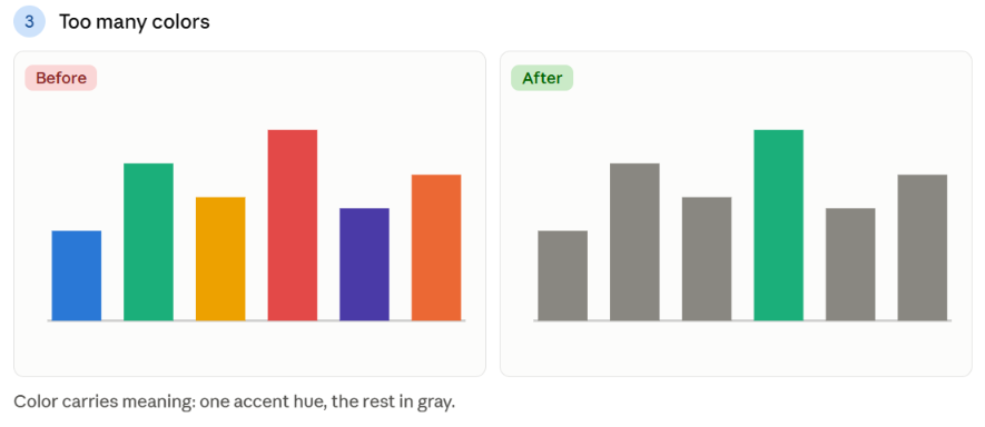
The problem: using a different color for each bar or point “to make it pretty.” The result: the reader looks for meaning where there is none, and the message drowns in the rainbow.
How to fix it: color must carry information, not decorate. A single hue is enough when all categories are of the same nature. Reserve one accent color to highlight the important element, and leave the rest in gray. Fewer colors, more meaning.
IV. The wrong chart for the need
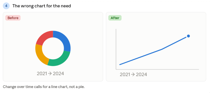
The problem: a line chart to compare categories with no time relationship, a pie chart to show change over time… The format contradicts the question asked, and the reader has to work to restore the meaning.
How to fix it: always start from the need before choosing the form — compare, show change over time, a breakdown, a correlation? That’s the whole point of our guide “Which chart to choose for your data.” The right type eliminates half the mistakes on its own.
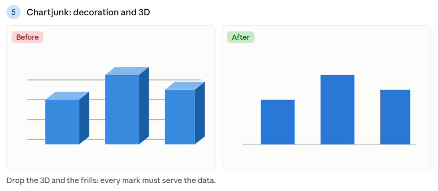
V. Chartjunk: decoration and 3D
The problem: 3D effects, shadows, gradients, background images, thick gridlines… All these frills add ink without adding information. Worse, 3D distorts proportions and makes values impossible to read.
How to fix it: apply the data-ink ratio principle: every stroke must serve the data. Remove the 3D (always), lighten the grids, drop the useless borders. A clean chart isn’t less beautiful — it’s more credible.
VI. Missing context
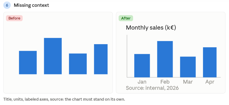
The problem: a chart with no title, no unit, no axis label, no source. Technically pretty, but impossible to interpret: 40… what? Over what period? Where do these numbers come from?
How to fix it: every visualization must answer, on its own, the questions what, when, how much, where from. An explicit title (ideally the message, not just the subject), clear units, labeled axes, and a cited source. A chart must remain understandable out of its context.
VII. The misleading order and inconsistent scales
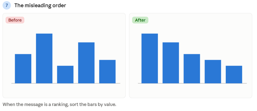
The problem: bars arranged alphabetically when you’re looking for a ranking; two charts side by side with different scales that suggest a false comparison; a secondary vertical axis that makes two unrelated lines “coincide.”
How to fix it: sort by value when the message is a ranking. Use identical scales for everything meant to be compared. Beware dual axes: they create illusory visual correlations. When in doubt, split into two honest charts rather than one misleading one.
Conclusion
These seven mistakes have one thing in common: they betray the data, through carelessness or an excess of decorative zeal. Avoiding them takes no artistic talent, only rigor — start at zero, limit the colors, label everything, sort what should be sorted. Before publishing a chart, ask yourself a single question: does it really help understanding, or is it mostly trying to impress?
A good chart is honest before it is beautiful. And most often, honesty is what makes it beautiful.