Which Chart to Choose for Your Data: The Complete Guide
Posted on June 30, 2026 • 5 min read • 1,059 wordsPie chart, bars, lines, scatter plot… Faced with your data, which one should you pick? This complete guide pairs each chart type with a precise need — comparing, showing change over time, a breakdown, or a correlation — so you never get it wrong again.
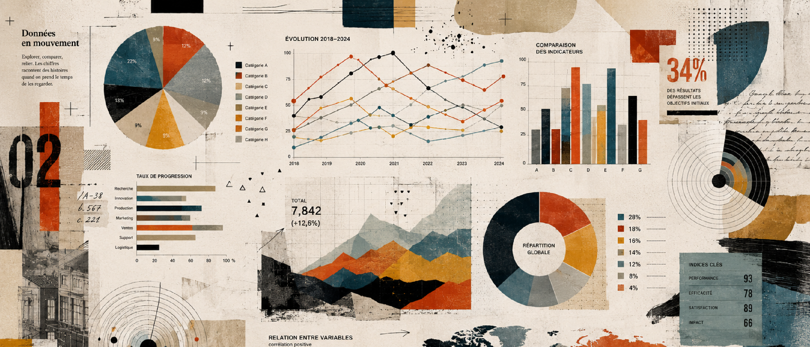
Faced with a dataset, the same question always comes up: “which chart should I use?” We hesitate, try a pie chart, then bars, and often pick the one that “looks best” rather than the one that tells the truth. Yet the right chart depends neither on fashion nor aesthetics: it depends on the question your data must answer. This guide gives you a simple method to choose with confidence.
I. Start from the need, not the chart
The most common mistake is choosing a chart for its shape. The right approach is the opposite: start from the intent. Most visualizations answer one of these five questions:
- Compare: which category is the largest / the smallest?
- Show change over time: how does a value evolve?
- Show a breakdown: how does a whole split into parts?
- Relate two variables: is there a link between two measures?
- Show a distribution: how are the values spread out?
Identify your question first. The chart type follows almost automatically — that’s the whole point of the sections below.
II. Comparing values
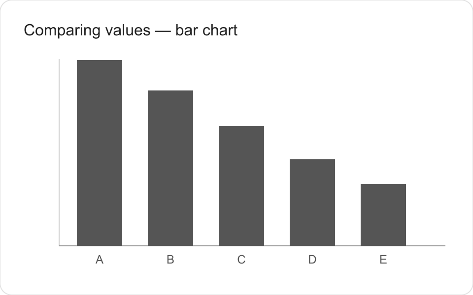
Need: rank or compare categories against each other (sales by product, traffic by source…).
The bar chart is the safest choice: the human eye compares lengths with great precision.
- Horizontal bars: ideal when labels are long or categories numerous.
- Vertical columns: perfect for a small number of categories.
- Radar: tempting for comparing several dimensions, but often misleading (areas distort perception). Reserve it for profiles with few axes.
Tip: sort your bars by value rather than alphabetically. A ranking reads instantly.
III. Showing change over time
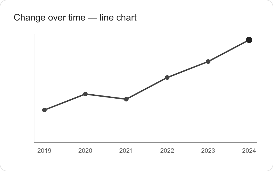
Need: track a trend over days, months, or years (monthly revenue, attendance…).
The line chart is the reference: it connects the points and brings out the trend.
- Area: a filled line, useful to emphasize a cumulative volume, but avoid it when several series overlap.
- Column-over-time (time histogram): suited to discrete, few periods (sales per quarter).
Golden rule: time always goes on the horizontal axis, left to right.
IV. Showing a breakdown
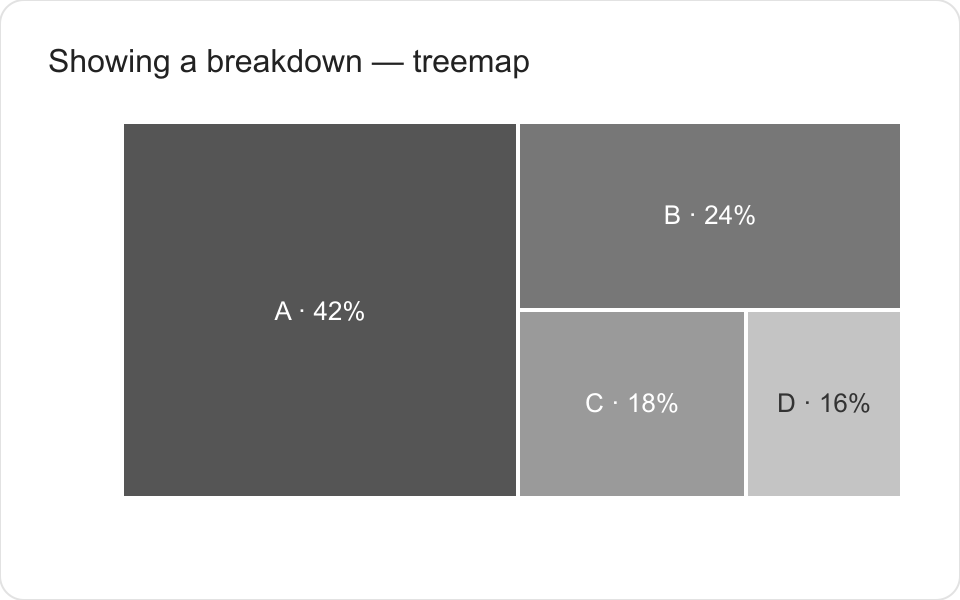
Need: show how a total divides into parts (market share, budget allocation…).
This is where we reach too quickly for the pie chart. It’s only readable with 2 to 3 clearly different slices. Beyond that, the eye can no longer compare angles.
- Bars: almost always more readable than a pie, especially beyond 4 categories.
- Stacked bars: useful for comparing the composition of several sets.
- Treemap: effective for many hierarchical parts in a compact space.
When in doubt, replace the pie chart with bars: you rarely lose anything.
V. Relating two variables (correlation)
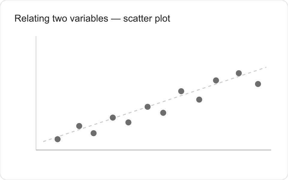
Need: check whether there’s a link between two measures (ad budget vs sales, age vs spending…).
The scatter plot is the dedicated tool: each point carries two coordinates, and the shape of the cloud reveals (or not) a relationship.
- Bubble chart: adds a third dimension through point size.
- Heatmap: ideal for visualizing the intensity of a crossing between two categories.
Beware the classic trap: correlation is not causation. A cloud that “rises” doesn’t prove that one variable causes the other.
VI. Showing a distribution
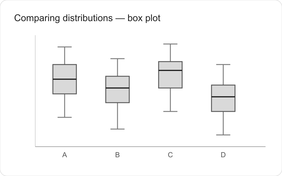
Need: understand how the values of a single measure are spread out (distribution of salaries, of response times…).
- Histogram: groups values into bins and shows where they concentrate.
- Box plot: summarizes median, quartiles, and extreme values — perfect for comparing several groups at a glance.
It’s the most often forgotten need, yet it answers an essential question: “are my data homogeneous or widely scattered?”
VII. Going further: less common charts (but valuable ones)
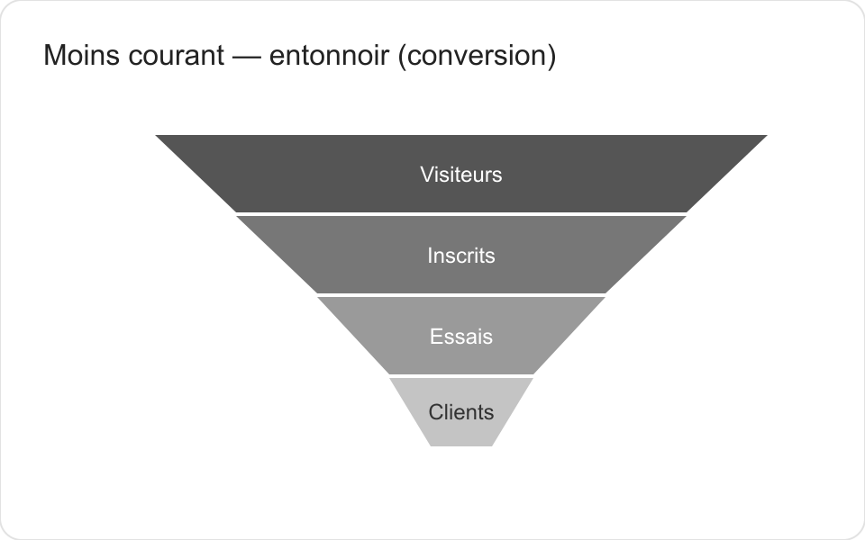
Beyond the great classics, some charts answer very specific needs. Little known, they are often the right answer where a standard chart struggles.
- Flow diagram (Sankey) — to visualize flows and transfers between stages: a user’s journey through a site, the breakdown of a budget, the sources and destinations of energy. The thickness of the links reflects the volume.
- Funnel — for a step-by-step conversion: visitors → sign-ups → customers. It makes the drop-off immediately visible.
- Waterfall — to break down a variation: how do you go from last year’s result to this year’s, positive or negative contribution per item.
- Slope chart — to compare two moments (before/after) across several categories: a single line per category reveals who rises and who falls.
- Bullet chart — to confront a value with a target: perfect on a dashboard, more compact and readable than a gauge.
- Calendar heatmap — for an intensity over time: day-by-day activity over a year (the famous “contribution wall”).
- Violin plot — a distribution richer than the box plot: it shows the full shape of the values’ density.
Handle with care: these formats are powerful but less familiar. Reserve them for an audience comfortable with data, or pair them with a clear legend.
VIII. The recap: from need to chart
| Your question | Recommended chart | Going further |
|---|---|---|
| Compare categories | Bars / columns | Slope chart, bullet chart |
| Show change over time | Line chart | Waterfall, calendar heatmap |
| Show a breakdown | Bars, treemap | Sankey, funnel |
| Relate two variables | Scatter plot, heatmap | Bubble chart |
| Show a distribution | Histogram, box plot | Violin plot |
Keep this table handy: it settles 90% of the hesitations.
IX. Getting practical: the tools
Once the right type is identified, you still have to produce it. No need to be a designer or a developer: many sites let you create clean charts in a few clicks, and code libraries exist for custom needs. We dedicate separate articles to them:
- the free tools to create a chart online;
- the choice of colors for a visualization (readability, accessibility);
- the common mistakes that make a chart unreadable or misleading.
The tool doesn’t make the right chart: it only executes the choice you’ve already made by starting from the need.
Conclusion
Choosing a chart isn’t a matter of taste but of method: identify the question first — compare, show change over time, a breakdown, a correlation, or a distribution — and the right format almost imposes itself. This reading grid will spare you both unreadable pie charts and misleading radars, and will finally make your data speak.
The most important thing to remember: a good chart doesn’t try to impress, it tries to make things understood.